1、确定控件应该继承的基类
从表面上看,目前WPF自带常用控件中,没有一个是接近这个表盘控件的,但将该控件拆分就能够发现,该控件的每个子部分都是在WPF中存在的,因此我们需要将各个子控件组合才能形成这个表盘控件,因此我们直接定义一个Dashboard类,继承自Control类。
2、设置Dashboard的样式
1
2
3
4
5
6
7
8
9
10
11
12
13
14
15
16
17
18
<``Style TargetType="{x:Type local:Dashboard}">
<``Setter Property="BorderBrush" Value="Black" />
<``Setter Property="BorderThickness" Value="1" />
<``Setter Property="Background" Value="Transparent" />
<``Setter Property="SnapsToDevicePixels" Value="True" />
<``Setter Property="UseLayoutRounding" Value="True" />
<``Setter Property="HorizontalContentAlignment" Value="Left" />
<``Setter Property="VerticalContentAlignment" Value="Center" />
<``Setter Property="Template">
<``Setter.Value``>
<``ControlTemplate TargetType="{x:Type local:Dashboard}">
<``Grid``>
</``Grid``>
</``ControlTemplate``>
</``Setter.Value``>
</``Setter``>
</``Style``>
主要注意的是,因为我们还不知道Dashboard内部到底有哪些东西,因此这里先放置了一个Grid,后面所有的代码将在
3、确定控件的内部基本构造
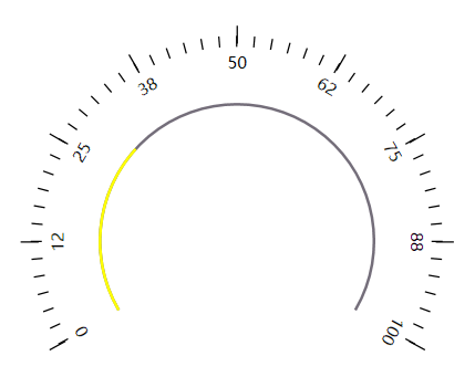
该表盘控件从表面上看去,共由三个部分组成
- 有文字显示的刻度
- 有进度展示的圆弧(红色与灰色部分的圆弧)
- 中间偏下的内容展示区域
确定内部的基本组成后,就会发现一个问题,WPF中貌似没有能显示文字的刻度这样的一个控件,也没有②中描述的这么一个控件。很明显①、②也是由各个子控件组合而成的。
虽然WPF中没有①中这样的控件,但我们知道有PathListBox与Arc这样的一个控件,Arc应该都知道,就是一段圆弧,但是PathListBox可能就有点陌生了,下面在正式讲解Dashboard控件前,有必要讲解一个PathListBox。
3.1、PathListBox
从控件字面上描述来看Path指的是路径,ListBox指的是一个列表。那么PathListBox组合起来就是按照一定的路径,来显示列表中的各个Item,下面使用具体代码来认识一下这个控件
①、命名空间
在WPF默认的System.Windows.Controls下面是找不到PathListBox的,需引入Microsoft.Expression.Controls.dll,然后在xaml中定义命名空间的别名
1
xmlns:ec="http://schemas.microsoft.com/expression/2010/controls"
②、具体用法
既然是按照一定路径排列各个Item,那肯定得先定义一个Path路径,这里先定义一个长500的直线Path
1
<``Path x:Name="path" Data="M0,0 500,0" Stroke="Black" StrokeThickness="1" />
然后放置PathListBox,在PathListBox的LayoutPath中去设置PathListBox应该按照哪个路径去排列,在ItemsTemplate中设置每个Item子项应该呈现成什么效果,最后在后台设置PathListBox的ItemsSource,设置PathListBox一共有几个Item子项。完整代码如下:
1
2
3
4
5
6
7
8
9
10
11
12
13
14
15
<``Grid VerticalAlignment="Center">
<``Path x:Name="path" Data="M0,0 500,0" Stroke="Black" StrokeThickness="1" />
<``ec:PathListBox x:Name="pathListBox">
<``ec:PathListBox.ItemTemplate``>
<``DataTemplate``>
<``Border Width="3" Height="10" Background="Black" SnapsToDevicePixels="True"
UseLayoutRounding="True" />
</``DataTemplate``>
</``ec:PathListBox.ItemTemplate``>
<``ec:PathListBox.LayoutPaths``>
<``ec:LayoutPath Distribution="Even" Orientation="OrientToPath"
SourceElement="{Binding ElementName=path}" />
</``ec:PathListBox.LayoutPaths``>
</``ec:PathListBox``>
</``Grid``>
其中Distributeion与Orientation是关键属性,SourceElement指向的就是PathListBox的排列路径。最终效果如下图所示:

3.2、Arc
Arc就是圆弧的意思,这个控件比较简单,直接贴出代码
①、命名控件
需引入Microsoft.Expression.Drawing.dll,然后在xaml中定义命名空间的别名
1
xmlns:ec="http://schemas.microsoft.com/expression/2010/controls"
②、具体用法
1
2
3
4
<``ed:Arc x:Name="DoubleCircle" ArcThickness="8" ArcThicknessUnit="Pixel"
EndAngle="120" StartAngle="-120"
Width="200" Height="200" Fill="Red"
Stretch="None" Stroke="Yellow" StrokeThickness="1" />
其中关键属性描述如下:
学习了下PathListBox与Arc的用法后,下面正式讲解Dashboard是如何创建的。
4、正式构建控件
4.1、刻度部分
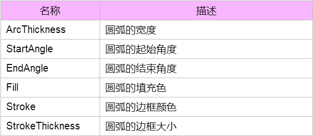
Dashboard表盘控件共有2种刻度,一个是长一点的刻度,一个是短一点的刻度。如果我们只是用一个PathListBox是不能达到这种效果的,因此这里使用了2个PathListBox,一个PathListBox放置短一点的刻度,一个PathListBox放置长一点的刻度,将他们2个叠加放在一起,就能达到这种效果。
4.1.1、长刻度部分
这里定义一个从-120°到120°的一个圆弧与一个PathListBox
1
2
3
4
5
6
7
8
9
10
11
12
13
14
15
16
17
18
<``ed:Arc x:Name="LongTickPath" Margin="0" ArcThickness="0" ArcThicknessUnit="Pixel"
EndAngle="120" StartAngle="-120" Stretch="None" Stroke="Black"
StrokeThickness="1" />
<``ec:PathListBox x:Name="LongTick" IsHitTestVisible="False">
<``ec:PathListBox.ItemTemplate``>
<``DataTemplate``>
<``Border Width="1" Height="13"
Background="Black"
SnapsToDevicePixels="True" UseLayoutRounding="False" />
</``DataTemplate``>
</``ec:PathListBox.ItemTemplate``>
<``ec:PathListBox.LayoutPaths``>
<``ec:LayoutPath Distribution="Even" Orientation="OrientToPath"
SourceElement="{Binding ElementName=LongTickPath}" />
</``ec:PathListBox.LayoutPaths``>
</``ec:PathListBox``>
但是这样只能看到圆弧,并没有看到PathListBox的刻度效果,因为PathListBox没有设置ItemsSource。而且由于我们是在自定义控件,因此为了设置PathListBox的ItemsSource的值,我们需要在Dashboard定义一个依赖属性LongTicksInternal,由于我们并不希望用户能够在外面能够设置LongTicksInternal的值,因此在依赖属性的set的时候,设置其访问权限,设置成private,这样就只能在样式里面访问该依赖属性,用户在外面使用的时候是看不到这个依赖属性的。
1
2
3
4
5
6
7
8
9
#region LongTicksInternal 长刻度集合
public IList<``object``> LongTicksInternal
{
get { return (IList<``object``>)GetValue(LongTicksInternalProperty); }
private set { SetValue(LongTicksInternalProperty, value); }
}
public static readonly DependencyProperty LongTicksInternalProperty =
DependencyProperty.Register(``"LongTicksInternal"``, typeof``(IList<``object``>), typeof``(Dashboard));
#endregion
定义了该依赖属性之后,将该依赖属性给绑定到PathListBox的ItemsSource上面去
1
ItemsSource=``"{TemplateBinding ShortTicks}"
绑定了依赖属性之后还是不能显示,因为LongTicksInternal目前是空的一个集合,还需要给LongTicksInternal赋值。
1
2
3
4
5
6
7
8
public Dashboard()
{
this``.LongTicksInternal = new List<``object``>();
for (``int i = 0; i < 10; i++)
{
this``.LongTicksInternal.Add(i);
}
}
效果如下:
1
2
3
4
5
6
7
8
9
#region LongTickCount 长刻度个数
public int LongTickCount
{
get { return (``int``)GetValue(LongTickCountProperty); }
set { SetValue(LongTickCountProperty, value); }
}
public static readonly DependencyProperty LongTickCountProperty =
DependencyProperty.Register(``"LongTickCount"``, typeof``(``int``), typeof``(Dashboard), new PropertyMetadata(5));
#endregion
改动下上面的for循环代码,这样就可以灵活的设置长刻度的个数了。
1
2
3
4
for (``int i = 0; i < this``.LongTickCount; i++)
{
this``.LongTicksInternal.Add(i);
}
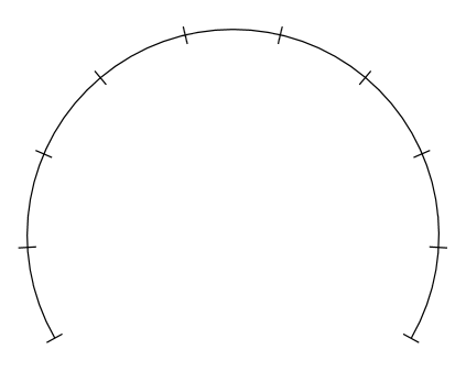
4.1.2、短刻度部分
再次定义一个Path与一个PathListBox,并新增一个依赖属性,用来设置PathListBox的ItemsSource
1
2
3
4
5
6
7
8
9
10
11
12
13
14
15
16
17
18
19
<``ed:Arc x:Name="ShortTickPath" Margin="0" ArcThickness="0" ArcThicknessUnit="Pixel"
EndAngle="120" StartAngle="-120" Stretch="None" Stroke="Black"
StrokeThickness="1" />
<``ec:PathListBox x:Name="ShortTick" IsHitTestVisible="False"
ItemsSource="{TemplateBinding ShortTicksInternal}">
<``ec:PathListBox.ItemTemplate``>
<``DataTemplate``>
<``Border Width="1" Height="8"
Background="Black"
SnapsToDevicePixels="True" UseLayoutRounding="False" />
</``DataTemplate``>
</``ec:PathListBox.ItemTemplate``>
<``ec:PathListBox.LayoutPaths``>
<``ec:LayoutPath Distribution="Even" Orientation="OrientToPath"
SourceElement="{Binding ElementName=ShortTickPath}" />
</``ec:PathListBox.LayoutPaths``>
</``ec:PathListBox``>
短刻度个数的依赖属性
1
2
3
4
5
6
7
8
9
#region ShortTicksInternal 短刻度集合
public IList<``object``> ShortTicksInternal
{
get { return (IList<``object``>)GetValue(ShortTicksInternalProperty); }
set { SetValue(ShortTicksInternalProperty, value); }
}
public static readonly DependencyProperty ShortTicksInternalProperty =
DependencyProperty.Register(``"ShortTicksInternal"``, typeof``(IList<``object``>), typeof``(Dashboard));
#endregion
但由于短刻度会有很多,不可能去细数表盘一共有多少个短刻度,而且如果手动设置所有的短刻度个数,会有一个问题就是短刻度和长刻度不会重合,导致宽的宽,窄的窄。我们不知道所有的短刻度个数,但是我们可以知道2个长刻度之间有多少个短刻度,因此定义一个ShortTickCount,用来设置2个长刻度间的短刻度的个数
1
2
3
4
5
6
7
8
9
#region ShortTickCount 短刻度个数
public int ShortTickCount
{
get { return (``int``)GetValue(ShortTickCountProperty); }
set { SetValue(ShortTickCountProperty, value); }
}
public static readonly DependencyProperty ShortTickCountProperty =
DependencyProperty.Register(``"ShortTickCount"``, typeof``(``int``), typeof``(Dashboard), new PropertyMetadata(5));
#endregion
根据LongTickCount与ShortTickCount,生成ShortTicksInternal
1
2
3
4
5
this``.ShortTicksInternal = new List<``object``>();
for (``int i = 0; i < (``this``.LongTickCount - 1) * (``this``.ShortTickCount + 1) + 1; i++)
{
this``.ShortTicksInternal.Add(``new object``());
}
这里简单介绍一下这个算法:LongTickCount有9个,ShortTickCount有5个,由图示可以看出,我们可以将表盘刻度分成8份,每一份由1个长刻度和5个短刻度组成,因此每一份的表达式就是【ShortTickCount + 1】,然后总共分为8份,表达式就成了 (LongTickCount - 1) * (ShortTickCount + 1),最后我们发现第9份只有一个长刻度,这其实也是一个短刻度,那么最终的表达式就是 (LongTickCount - 1) * (ShortTickCount + 1) + 1

微调下Arc的边框,将其去掉,然后调整下短刻度的Arc的Margin,将其调整成和长刻度的底部水平
1
2
3
4
5
6
7
8
9
10
11
12
13
14
15
16
17
18
19
20
21
22
23
24
25
26
27
28
29
30
31
32
33
34
35
36
37
38
<``ed:Arc x:Name="LongTickPath" Margin="0" ArcThickness="0" ArcThicknessUnit="Pixel"
EndAngle="120" StartAngle="-120" Stretch="None" Stroke="Black"
StrokeThickness="0" />
<``ec:PathListBox x:Name="LongTick" IsHitTestVisible="False"
ItemsSource="{TemplateBinding LongTicksInternal}">
<``ec:PathListBox.ItemTemplate``>
<``DataTemplate``>
<``Border Width="1" Height="13"
Background="Black" VerticalAlignment="Bottom"
SnapsToDevicePixels="True" UseLayoutRounding="False" />
</``DataTemplate``>
</``ec:PathListBox.ItemTemplate``>
<``ec:PathListBox.LayoutPaths``>
<``ec:LayoutPath Distribution="Even" Orientation="OrientToPath"
SourceElement="{Binding ElementName=LongTickPath}" />
</``ec:PathListBox.LayoutPaths``>
</``ec:PathListBox``>
<``ed:Arc x:Name="ShortTickPath" Margin="5" ArcThickness="0" ArcThicknessUnit="Pixel"
EndAngle="120" StartAngle="-120" Stretch="None" Stroke="Black"
StrokeThickness="0" />
<``ec:PathListBox x:Name="ShortTick" IsHitTestVisible="False"
ItemsSource="{TemplateBinding ShortTicksInternal}">
<``ec:PathListBox.ItemTemplate``>
<``DataTemplate``>
<``Border Width="1" Height="8"
Background="Black" VerticalAlignment="Bottom"
SnapsToDevicePixels="True" UseLayoutRounding="False" />
</``DataTemplate``>
</``ec:PathListBox.ItemTemplate``>
<``ec:PathListBox.LayoutPaths``>
<``ec:LayoutPath Distribution="Even" Orientation="OrientToPath"
SourceElement="{Binding ElementName=ShortTickPath}" />
</``ec:PathListBox.LayoutPaths``>
</``ec:PathListBox``>
终于,刻度的效果出来了
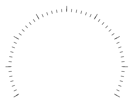
4.1.3、文字部分
上一节已经将刻度做出来了,还差一个文字部分。文字部分与刻度部分同理,只不过不显示成刻度了,需将每个Item的样式设置成TextBlock
1
2
3
4
5
6
7
8
9
10
11
12
13
14
15
<``ed:Arc x:Name="NumberPath" Margin="20" ArcThickness="0" ArcThicknessUnit="Pixel"
EndAngle="120" StartAngle="-120" Stretch="None" />
<``ec:PathListBox x:Name="Number" IsHitTestVisible="False"
ItemsSource="{TemplateBinding NumberListInternal}">
<``ec:PathListBox.ItemTemplate``>
<``DataTemplate``>
<``TextBlock Text="{Binding}" />
</``DataTemplate``>
</``ec:PathListBox.ItemTemplate``>
<``ec:PathListBox.LayoutPaths``>
<``ec:LayoutPath Distribution="Even" Orientation="OrientToPath"
SourceElement="{Binding ElementName=NumberPath}" />
</``ec:PathListBox.LayoutPaths``>
</``ec:PathListBox``>
1
2
3
4
5
6
7
8
9
#region NumberListInternal 数字集合
public IList<``object``> NumberListInternal
{
get { return (IList<``object``>)GetValue(NumberListInternalProperty); }
set { SetValue(NumberListInternalProperty, value); }
}
public static readonly DependencyProperty NumberListInternalProperty =
DependencyProperty.Register(``"NumberListInternal"``, typeof``(IList<``object``>), typeof``(Dashboard));
#endregion
由于表盘上面显示的数字会有不同,因此应该让其可以设置,因此定义一个最大值与最小值的依赖属性,表盘上面的文字应该根据这两个属性来自动生成
1
2
3
4
5
6
7
8
9
10
11
12
13
14
15
16
17
18
19
20
21
22
23
24
25
26
27
28
29
30
31
32
33
34
35
36
37
38
39
40
#region Minimum 最小值
/// <summary>
/// 最小值依赖属性,用于Binding
/// </summary>
public static readonly DependencyProperty MinimumProperty =
DependencyProperty.Register(
"Minimum"``,
typeof``(``double``),
typeof``(Dashboard),
new PropertyMetadata(0.0));
/// <summary>
/// 获取或设置最小值.
/// </summary>
/// <value>最小值.</value>
public double Minimum
{
get { return (``double``)GetValue(MinimumProperty); }
set { SetValue(MinimumProperty, value); }
}
#endregion
#region Maximum 最大值
/// <summary>
/// 最大值依赖属性,用于Binding
/// </summary>
public static readonly DependencyProperty MaximumProperty =
DependencyProperty.Register(
"Maximum"``,
typeof``(``double``),
typeof``(Dashboard),
new PropertyMetadata(100.0));
/// <summary>
/// 获取或设置最大值.
/// </summary>
/// <value>最大值.</value>
public double Maximum
{
get { return (``double``)GetValue(MaximumProperty); }
set { SetValue(MaximumProperty, value); }
}
#endregion
由于文字只在长刻度下面显示,因此在设置Long的for循环中设置的值
1
2
3
4
5
6
this``.NumberListInternal = new List<``object``>();
for (``int i = 0; i < this``.LongTickCount; i++)
{
this``.NumberListInternal.Add(Math.Round(``this``.Minimum + (``this``.Maximum - this``.Minimum) / (``this``.LongTickCount - 1) * i));
this``.LongTicksInternal.Add(i);
}
算法解析:上面已经说到,我们将表盘刻度分成了8份,那么 (this.Maximum - this.Minimum) / (this.LongTickCount - 1) 可以得到每一份所代表的值,每一份乘以i,就表示接下来的每份的值,但是表盘不可能永远都是从0开始的,我们会给它设置最小值,因此得加上Minimum,最后得出来的结果有可能会有小数点,为了省去这个小数点,使用了Math.Round()函数来取整。至此,刻度与数字部分完成了。

4.2、进度(当前值)部分

这段圆弧一共由两个圆弧组成,红色表示当前值,灰色只是作为底色展示用的,并无太大作用
1
2
3
4
5
6
7
8
9
10
11
<``ed:Arc x:Name="DoubleCircle" Margin="50" ArcThickness="1" ArcThicknessUnit="Pixel"
EndAngle="120"
SnapsToDevicePixels="True"
StartAngle="-120"
Stretch="None" Stroke="#746E7A" StrokeThickness="1" UseLayoutRounding="True" />
<``ed:Arc x:Name="PART_IncreaseCircle" Margin="50" ArcThickness="1" ArcThicknessUnit="Pixel"
RenderTransformOrigin="0.5,0.5"
StartAngle="-120" EndAngle="10"
Stretch="None" Stroke="Yellow" StrokeThickness="1" />
效果如下:
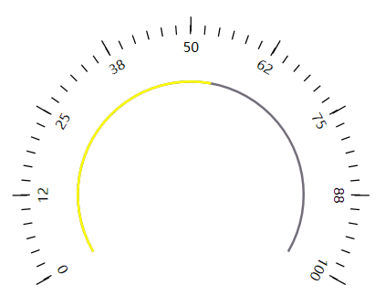
至此,控件的内部构造基本完成,接下来完成最后一部分,就是根据表盘当前值来设置黄色部分的角度,从而实现仪表盘的效果。
上面我们已经定义了最大值与最小值,还差一个当前值Value,因此定义一个Value的依赖属性
1
2
3
4
5
6
7
8
9
10
11
12
13
14
15
16
17
18
19
20
21
22
23
24
25
26
#region Value 当前值
/// <summary>
/// 最大值依赖属性,用于Binding
/// </summary>
public static readonly DependencyProperty ValueProperty =
DependencyProperty.Register(
"Value"``,
typeof``(``double``),
typeof``(Dashboard),
new PropertyMetadata(0.0, new PropertyChangedCallback(OnValuePropertyChanged)));
/// <summary>
/// 获取或设置当前值
/// </summary>
public double Value
{
get { return (``double``)GetValue(ValueProperty); }
set { SetValue(ValueProperty, value); }
}
private static void OnValuePropertyChanged(DependencyObject d, DependencyPropertyChangedEventArgs e)
{
}
#endregion
之外为了设置圆弧的角度,还需要新增一个Angle依赖属性
1
2
3
4
5
6
7
8
9
#region Angle
public double Angle
{
get { return (``double``)GetValue(AngleProperty); }
set { SetValue(AngleProperty, value); }
}
public static readonly DependencyProperty AngleProperty =
DependencyProperty.Register(``"Angle"``, typeof``(``double``), typeof``(Dashboard), new PropertyMetadata(0d));
#endregion
在代码中,根据Value的值,自动设置Angle
1
2
3
4
5
6
private void SetAngle()
{
var diff = this``.Maximum - this``.Minimum;
var valueDiff = this``.Value - this``.Minimum;
this``.Angle = -120 + (120 - (-120)) / diff * valueDiff;
}
算法解析:结束角度-起始角度可以得出圆弧总共经过的角度值,除以最大值与最小值的差值,得到1°对应的数值,乘以当前值与最小值的差值就可以得到差值所对应的角度总和了。由于起始角度不固定,因此最终的角度值应该是:起始角度+差值角度和
最终,我们的效果实现了:
这里面有一个不足的地方就是起始角度和结束角度硬编码成-120和120了,为了灵活性,可以将其设置为2个依赖属性,这个就自己去弄吧,这里就不贴出代码了。